 |
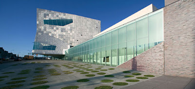
| Walker Art Center Minneapolis |
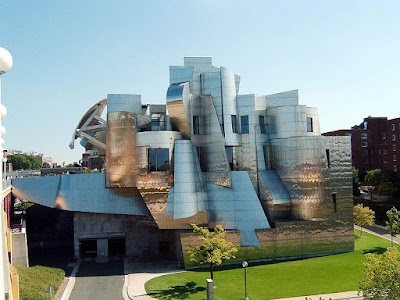 |
| Weisman Art Museum University of Minneapolis |
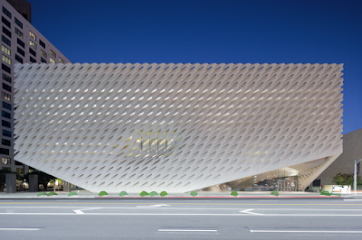 |
| The Broad, Los Angeles |
The private collection at the Broad was just that, not a survey of contemporary art but a personal choice with big names. The show at the Walker had some wonderful stars but quite a few misses and seemed very experimental. Weisman contained what appeared to be a study collection suitable for a university with many modern masters. The Broad gave a first impression of glitz and glamour with shiny works in bright colors. When you got to the modern works by Jasper John and irk, they almost seemed dull and dated. That was the same feeling you got at the Weisman. But the work at the Walker has that same slickness to it which lifted it from looking to immature. .
Walker Art Center
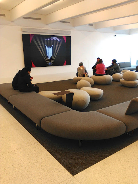 |
| Walker Lobby with video screen |
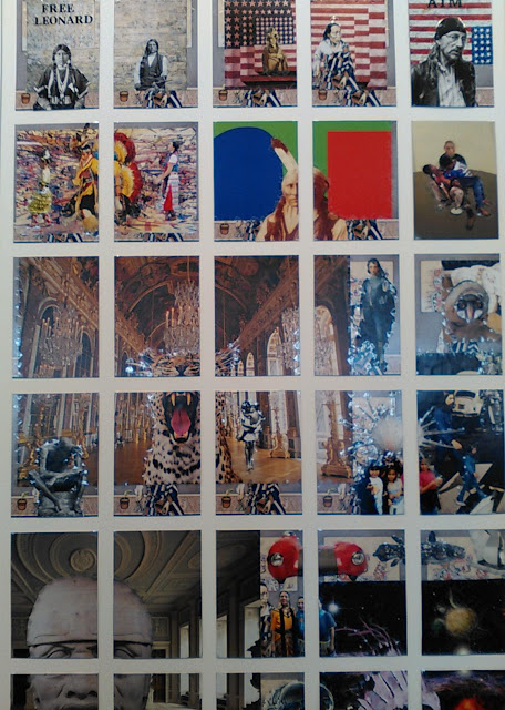 |
| Frank Big Bear gave us a whole wall of collaged images and this is just one tiny section. It is displayed on one side of the restaurant in the lobby. |
 |
| Claes Oldenburg |
 |
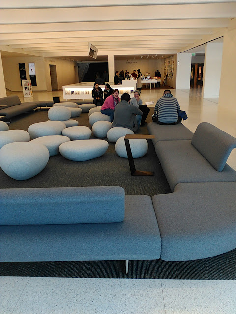
| more second floor lobby views |
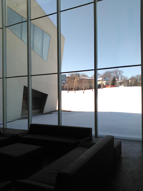 |
| more lobby views |
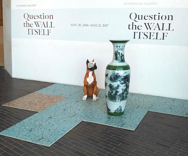
Question the Wall Itself is simply an exhibition about space. But it is human space and we relate to it. There were 23 artists who gave us rooms either full or partial or works that made us reflect on public and private interiors. Featured in the exhibition, which includes several new commissions, are works by Jonathas de Andrade, Uri Aran, Nina Beier, Marcel Broodthaers, Tom Burr, Alejandro Cesarco, Marc Camille Chaimowicz, Theaster Gates, Ull Hohn, Janette Laverrière/Nairy Baghramian, Louise Lawler, Nick Mauss, Park McArthur, Lucy McKenzie, Shahryar Nashat, Walid Raad, Seth Siegelaub, Paul Sietsema, Florine Stettheimer, Rosemarie Trockel, Cerith Wyn Evans, Danh Vo, and Akram Zaatari.
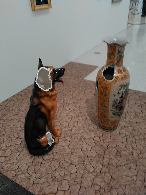 |
| Nina Bieir |
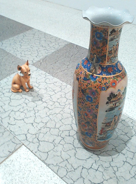 |
| Nina Bieir |
 |
| Nina Bieir |
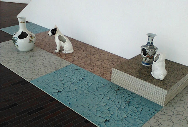 |
| Nina Bieir |
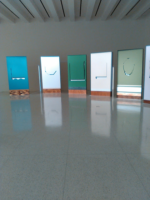 |
| Walid Raad |
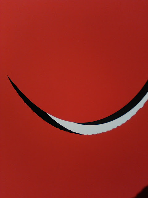 |
| Walid Raad - the dark lines here are shadows that change depending on where your look. |
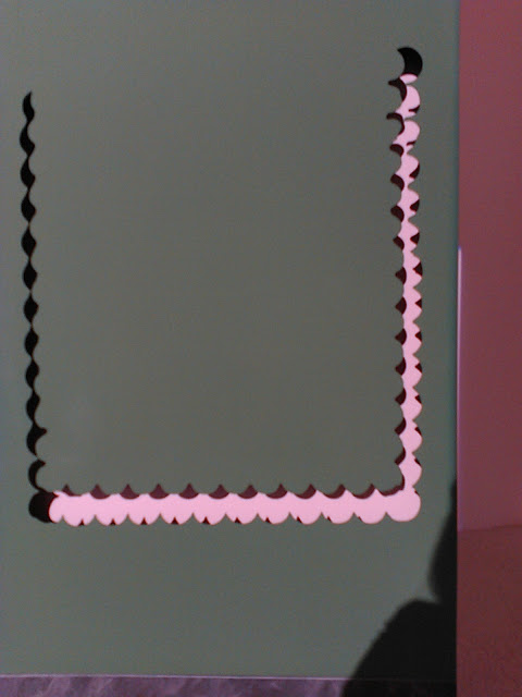 |
| Walid Raad |
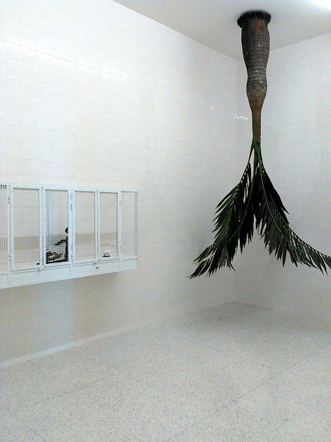 |
| What you can't see in this picture of Rosemarie Trockel's room was the tiny toy birds that moved back and forth or turned side by side in the case on the left. |
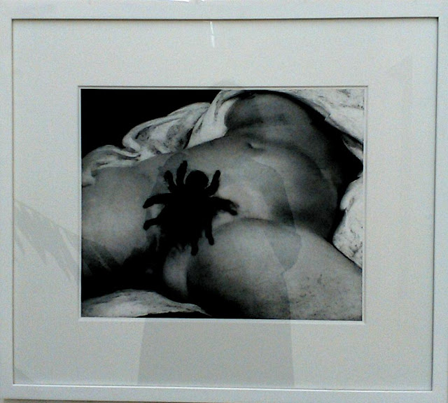 |
| Rosemarie Trockel |
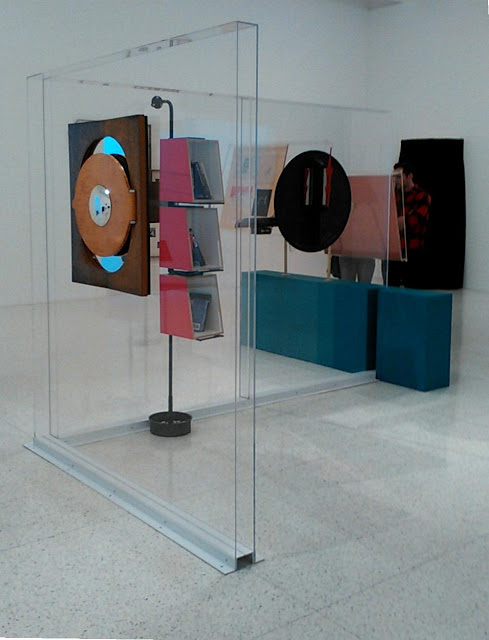 |
| Janette Laverriere/Nairy Baghramian |
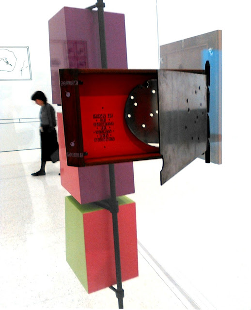 |
| Janette Laverriere/Nairy Baghramian |
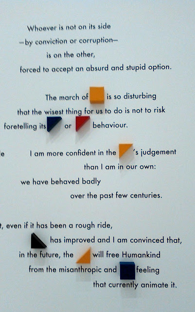 |
| Jonathas de Andrade |
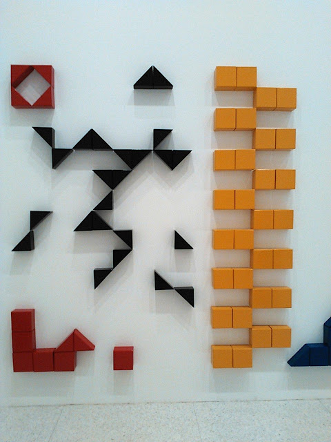 |
| Jonathas de Andrade |
Unpacking the Box
Also at the Walker was Unpacking the Box anchored by the Marcel Duchamp Boite en valise. But there were mulitlpe modern and fluxus takes on this theme as well. Everything was small, portable and limited editions. These works were all meant to be touched but of course now they are safely displayed behind glass. However a little video with a museum handler in white gloves did demonstration how they could be played with as these works do rather looks like toys. Curators: Jordan Carter and Victoria Sung
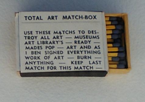 |
| Ben Vautier |
 |
| Marcel Duchamp |
Weisman Art Museum
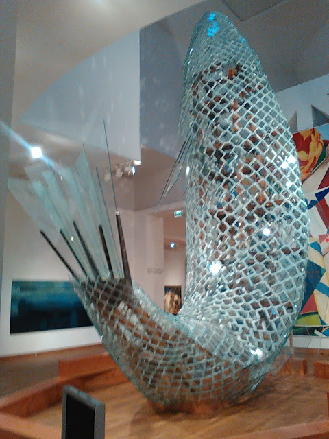 |
| Frank Gehry giant fish sculpture made from slabs of glass and steer structure. This work rises into the antrium of the space. |
The Talking Cure
WAM’s Target Studio for Creative Collaboration is a special space in the museum and this show was one where the artist encouraged you to come up with your own stories to add meaning to her works.. Sometimes this seems like a sort of cop out, but the works were so visually strong that they encourage contemplation. If the artist has there own personal story about each peace, even if we don't hear it, there does seem to be an honesty about the work and these works felt that way.
 |
| Melissa Stern |
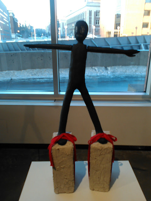 |
| Melissa Stern |
 |
| Melissa Stern |
The Broad Los Angeles
The Broad is a new contemporary art museum founded by philanthropists Eli and Edythe Broad on Grand Avenue in downtown Los Angeles which opened in September of 2015. It is home to the 2,000 works of art in the Broad collection. The 120,000-square-foot, $140-million building features two floors of gallery space. I wonder what a person from the future would think of our civilization by viewing this art.
 |
| Ellen Gallagher is one of my most favorite artists for this series of work. |
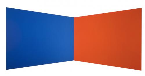 |
| Ellsworth Kelly play with your visual senses in this work that is totally flat but seems to change shape as you walk in front of it from side to side. |
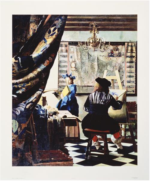 |
| Malcolm Morley was one of the first artists to win the Turner Prize which begun which I first arrives in the UK over 40 years ago. |
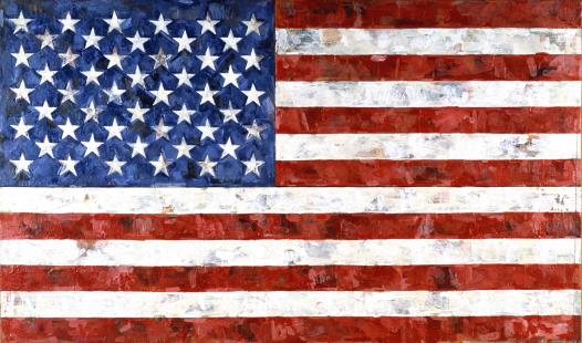 |
| Jaspar Johns |
 |
Takashi Murakami |
 |
| This was my husband's favorite work: Jeff Koons |




No comments:
Post a Comment
Thank you for writing. We read every comment and review it.
Unfortunately, if your comment is anonymous it will not be made public.